A quick update on my goings-on, as I've been going-around. I was out of town for a few days again this week...last trip until February! Woohoo! But that meant I had to do a little radio silence again as I had very little Internet access while I was gone. I did manage to knock out some more blocks on my niece's Christmas quilt on Sunday afternoon, though, so here's a sneak preview of what we're aiming for.
I hope to get the center pieced tonight, and then borders on tomorrow, so I can get it to Andrea (my fabulous long-arm quilter) early next week.

Sandy's blog on quilting, life, and sundry.
Friday, November 18, 2011

Saturday, November 12, 2011
What Would (a) Quilter Do?
My guild is doing another paint chip challenge--one of my faves! We draw three paint chips at random from a jar. We then have to use fabrics in those colors, add a black and a white, and make it work. We're not supposed to use fabrics that have any other colors in them--and no shades or tints. It has to be as close to that actual color as we can manage to get. I'm thinking it would be virtually impossible to avoid having any other colors at all in our projects unless we all only use solids--I'm trying to remember what I did last time we did this a few years back. However, our guild can be quite forgiving, shall we say. And there's really nothing at stake--it's just for fun. So although I'm interpreting it pretty darn closely (yes, I am using predominantly solids), I may veer just a hair off the path.
I know what I'm doing--I immediately saw it in my mind when I looked at these three colors in my hand. I just went online this morning and bought the fabric I'll be using; although I've got plenty of black and white in my stash, I didn't have anything distinctly any of these colors.
I'm curious: What would you do with these? What do they say to you? (Leave your own response by November 27th and I'll draw one lucky commenter's name for a fabricy gift! *Editor--I've extended the deadline a few days because of a glitch in my podcast that meant I couldn't give listeners as much lead-time as I'd like. So you have a few more days to respond!)

I know what I'm doing--I immediately saw it in my mind when I looked at these three colors in my hand. I just went online this morning and bought the fabric I'll be using; although I've got plenty of black and white in my stash, I didn't have anything distinctly any of these colors.
I'm curious: What would you do with these? What do they say to you? (Leave your own response by November 27th and I'll draw one lucky commenter's name for a fabricy gift! *Editor--I've extended the deadline a few days because of a glitch in my podcast that meant I couldn't give listeners as much lead-time as I'd like. So you have a few more days to respond!)


Thursday, November 10, 2011
Yes, it's another WIP
I just can't seem to stop myself. Yet another project in progress. This is the Sausalito line from P&B Textiles--very purdy. The quilt should come together pretty quickly...a girl can dream, anyway.
I'll keep you posted!
Working on this week's podcast episode--should go live tomorrow...

I'll keep you posted!
Working on this week's podcast episode--should go live tomorrow...
Sunday, November 6, 2011
Hand-dyeing Fun
Like my last post, this one is also related to episode 66, "In Which We Go on Retreat," of my podcast series. In that episode I described the class we had in dyeing fabric. What a hoot!
 The first example is my least favorite, which is why I'm starting out with it. Maybe seeing the others below will blank this one out of your memory.
That being said, parts of the stripes look like a reflection on a calm lake...so I can easily see some fussy-cut-utility here.

I heart this one. Blues, greens, and lots of white space.
 My first attempt at the Shibori technique. (For a great blog post about Shibori, visit here.)
Didn't work so well because my fabric really wanted to come unwrapped when I scrunched it down the PVC pipe. I like the colors and it's still a very usable result, but I wanted a more distinct pattern...
 ...and so I tried it again. Got a much better pattern this time, but traded off the heavy orange at the end of the last one with a lot of white at the end of this one. This technique takes some practice.
 I had no idea the blue was going to turn out this brilliant...and no, no photo-editing involved! The other color is raspberry, which also came out pretty intense, but I did dunk the hey out of it so I suppose it's no surprise. Digging the results.
I believe I just wadded this one up randomly and wrapped rubber bands around it at a variety of angles.

No idea how I did this. Wish I could remember because it's a look I'd love to replicate in other colors. It's a mix of teal and plum. (The center looks bright white in this picture--it's actually more of a very, very soft teal.)
 And my other fave. Looks like a frosty windowpane, doesn't it? Super cool. Too bad I have no idea how I did that one either.
I had a blast dying fabric. So much so that I've promised myself I'm not going to buy any of the supplies to do more until I've used at least a few of these pieces in a project.
So I guess that means I have to get to work!

That being said, parts of the stripes look like a reflection on a calm lake...so I can easily see some fussy-cut-utility here.

I heart this one. Blues, greens, and lots of white space.

Didn't work so well because my fabric really wanted to come unwrapped when I scrunched it down the PVC pipe. I like the colors and it's still a very usable result, but I wanted a more distinct pattern...


I believe I just wadded this one up randomly and wrapped rubber bands around it at a variety of angles.

No idea how I did this. Wish I could remember because it's a look I'd love to replicate in other colors. It's a mix of teal and plum. (The center looks bright white in this picture--it's actually more of a very, very soft teal.)

I had a blast dying fabric. So much so that I've promised myself I'm not going to buy any of the supplies to do more until I've used at least a few of these pieces in a project.
So I guess that means I have to get to work!
Saturday, November 5, 2011
Retreat Progress
In episode 66, I give an overview of my quilt guild retreat a couple of weeks ago, with some product reviews and project updates. I promised pics...here they be!
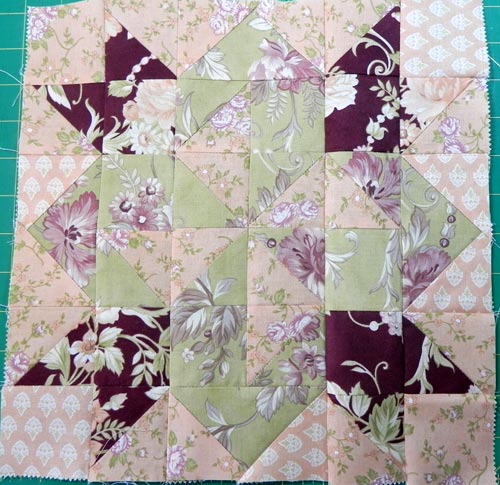

One of the only two blocks I got done for the Jelly Roll Sampler quilt, "Tulip" block. (From Jelly Roll Sampler Quilts by Pam and Nicky Lintott. I think this is the Fig & Plum jelly roll by Fig Tree Quilts for Moda.)
Because of the way the dark strip gets cuts, some of the print makes certain pieces blend a lot with the background. Fussy-cutting isn't really an option when you're trying to stick with just using a single jelly roll with no additions for the project. Oh well. C'est la vie.
"Rocky Road" block (from same).
I really like the blue in this fabric line. Nice cross between beachy and cottage-y.


"Triangle Tablerunner" kit from Generations Quilt Shop.
(I talk about Generations in episode 64.)
Not hard to put together as long as (as they suggest) you keep track of where the straight-of-grain edge is on each of the triangles and make sure they're on the outside edge--keeps the strip a lot more stable. I like the red sashing.
Close-up of part of "Triangle Tablerunner" kit to show fabrics.
I'm bumming I can't see more of my fat little birdies with Santa caps. They're dang cute, aren't they?

But it's still a nice cuddle quilt for a rainy day.
Of course, now that I'm looking at it again, I'm seeing blocks I'd like to swap around. Random. Pshaw.
Stay tuned for another blog post in a couple of days with hand-dyed goodness!
Monday, October 31, 2011
Fabric Mysteriously Appearing on My Shelves
I have nothing to do with this...really...it just keeps showing up, somehow.
 The first few pics are from my most recent purchase at The Quilter's Daughter during my quilt retreat weekend. (They don't have a website yet but this link gives you their info.)
Picked these out as rough coordinates but may not keep them together. A couple are from the "Swanky" line by Chez Moi for Moda. It's a couple of years old now so I couldn't find any good links to use--sorry! (Yellow dots is from Deb Strain's "LoveU" line for Moda. The green floral had no selvedge on it to label it.)
 General blender fat quarters. Always helpful!

Another collection of bright, fun fat quarters. One of these (the trees) is from "Summer Song" by My Mind's Eye for Moda; the print with flowers and butterflies is from Deb Strain's "LoveU" line for Moda. Neither of the other two had selvedges so I can't identify them for you. Apologies!
 This was my souvenir from Stitch, the fabric and yarn shop I found in Jordan, Ontario. I got two identical charm packs from the Modal "Little Apples" line, and then bought a half yard of the fantastic dog fabric--it coordinates with the Little Apples line but it's from a previous line. My family-of-birth raised English Springer Spaniels when I was growing up so these little spaniel-esque doggies are very nostalgic for me.
 And this grouping was my souvenir from Ye Olde Fabric Shoppe in Stratford, Ontario--I talked about that in episode 60. I love the fact that these are holiday fabrics without being overtly traditional Christmas colors of green and red. I put some green and red in there with the coordinates I chose, but they're still more muted than typical. And I love the neutrals and gray-blues.
I have more Christmas fabric than I know what to do with. Some year I'll just have to do a year-long holiday project challenge to clean out my collection!

Picked these out as rough coordinates but may not keep them together. A couple are from the "Swanky" line by Chez Moi for Moda. It's a couple of years old now so I couldn't find any good links to use--sorry! (Yellow dots is from Deb Strain's "LoveU" line for Moda. The green floral had no selvedge on it to label it.)


Another collection of bright, fun fat quarters. One of these (the trees) is from "Summer Song" by My Mind's Eye for Moda; the print with flowers and butterflies is from Deb Strain's "LoveU" line for Moda. Neither of the other two had selvedges so I can't identify them for you. Apologies!
 This was my souvenir from Stitch, the fabric and yarn shop I found in Jordan, Ontario. I got two identical charm packs from the Modal "Little Apples" line, and then bought a half yard of the fantastic dog fabric--it coordinates with the Little Apples line but it's from a previous line. My family-of-birth raised English Springer Spaniels when I was growing up so these little spaniel-esque doggies are very nostalgic for me.
I have more Christmas fabric than I know what to do with. Some year I'll just have to do a year-long holiday project challenge to clean out my collection!
Sunday, October 30, 2011


Subscribe to:
Posts (Atom)