

You can see right in the center of this layout the teal strip with a small floral print. That was my starting point. I like teal, but this is a particularly murky one with a very odd little floral.
 Working off the teal, I pulled blues and greens, and then used the fuschia of the floral to pull me to the opposite side of the color wheel; hence, the pinks/fuschias.
 I took a b&w shot just to check my contrast. I wasn't worried about having a ton of contrast in the strips because they were going to be against a white background. (Which, by the way, I did end up having to go out and buy because I didn't have enough true whites in my stash.)
 Editor's note: I should apologize for the photography. I was relying on my cell phone which takes decent pics in the great outdoors, not so great in the dimly lit indoors. Plus, I can't stand far enough away from my design wall to get the full design.
 Blocks complete. Ignore the setting for now--we'll come back to that in a bit.
Here's the challenge strip in the center row of the strip sets on these four blocks. Not too bad!
The strip tubing pattern I used creates "roman stripe" blocks--each strip set creates between 4-6 blocks, depending on how long the strips are (again, posting on that later so don't sweat it now), with alternation between the first and third strip.
N.B.: I'm not going to spend much time quilting this. Most likely, I'll do an all-over meander or something along those lines, as the idea is to still keep it fairly fast and easy as a donation quilt. That's an important point to keep in mind as we look at the setting options: some are the type that scream out for really nice quilting, others can carry an all-over design a lot more easily.

I'm not sure that this one is really an option for me--but it's a kind of cool effect of the alternating strip sets when you put the four matching blocks together.
For me, this isn't really an option mostly because you'll see one lonely block at the bottom that wouldn't fit with this set...and...

Yes, that means I could get a second quilt out of this but I'm trying to expedite my time on this project at the moment. (Normally, potentially getting two quilts from one set of blocks would be a whoop-de-doo moment, so keep that in mind when planning your own donation quilts--this might be a method for you.)
So here are the real options I'm offering up to you.

OPTION 2: Traditional Roman Stripe set.
Very scrappy, nicely geometric, easy to see done with an overall meander quilt. No one fabric really sticks out this way.
(BTW, note about fabric: there are a couple of blues in these pictures that seem to jump off the page. They're not that stand-out-y in real life. Sorry about that. Lighting and bad cell phone picture issues.)

And this setting--and all that follow--only leave me with three little orphan blocks, that I can easily use up somehow. Or hand them off to someone in my guild to figure out how to use. In any case, manageable.
Funky!

Still funky!

I really like it in theory, but the white space seems to really want feathers or something fancy like that. Not likely to happen. Could, however, do some fast vines with leaves or something. So, not out of the running yet.

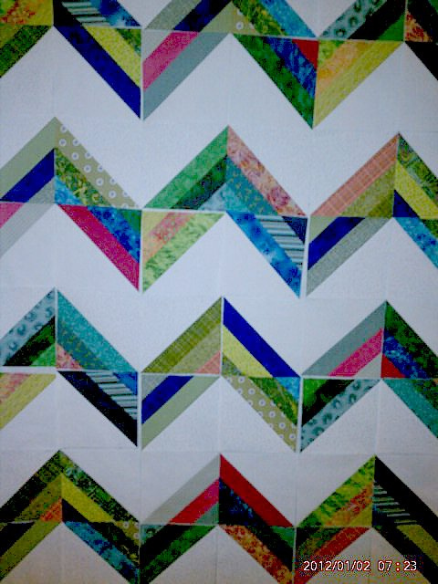
OPTION 5: Radiant, Version 1
Nice!
(By the way, I realized after taking this picture that there's one block I'd forgotten to flip. Oops.)

Also nice!
So, "what would a quilter do?" If you were making this quilt, which of these options might you lean towards?
I'm not likely to get much sewing time today so I thought that would give y'all some time to give me your thoughts. I've got a couple of front-runner options for myself but it'll be interesting to see if there's a majority of opinion anywhere!